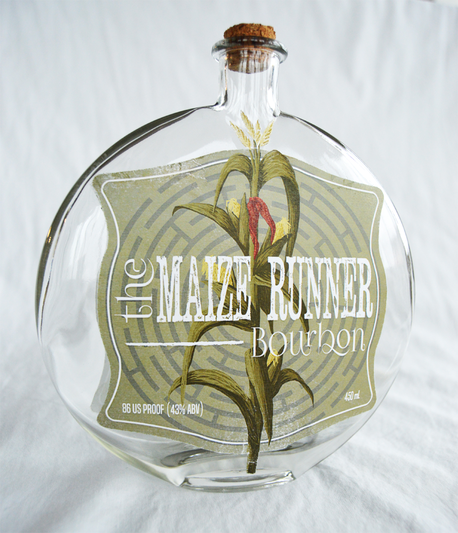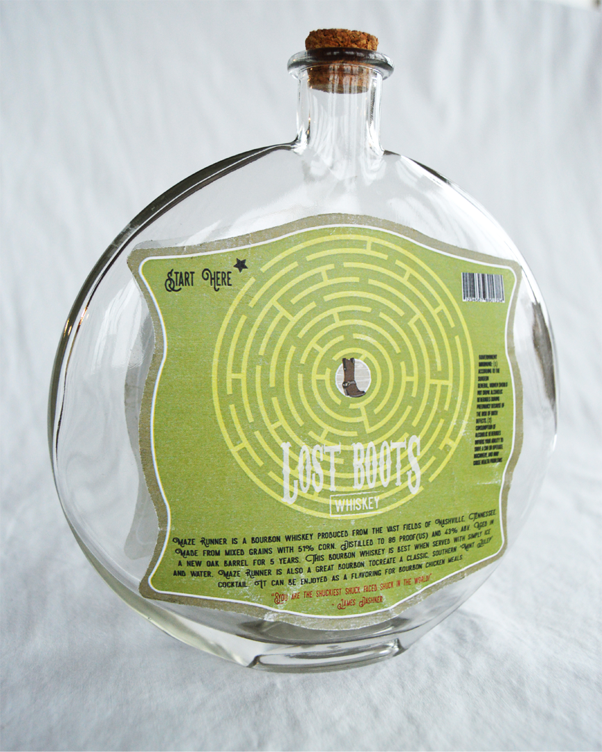

This pieces is an example of my first experience with packaging design. The objective was to design a brand and packaging label for a beverage company. The company I created named ‘Lost Boots Whiskey’, uses a play on words for bootleggers. I chose to use a round yet flat and almost flask shaped bottle. After research, I concluded that when scoping the shelves for a new whiskey some tend to be more drawn to old western or southern style looks, because it usually means the drink has a more authentic taste. I also noticed that most Bourbon labels have a tendency of sharing white and brown labels with old western style designs and writing as if it has the original labels from years ago. So, my goal for this piece was to create a modern western bourbon label. Therefore, I created ‘The Maize Runner’ bourbon. Again, using a play on words inspired from the book titled ‘The Maze Runner,’ by James Dashner. I even include a literal maze on both sides of the label for consumer entertainment. I imagine a consumer trying to complete the maze on the back of the bottle the same way a child would complete puzzles on the back of cereal boxes. I received a lot of positive feedback for this project.